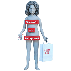
Barbara Kruger (b. 1945) is an American conceptual artist. Much of her work consists of black-and-white photographs overlaid with declarative captions—in white-on-red Futura Bold Oblique or Helvetica Ultra Condensed. The phrases in her works often include use of pronouns such as ‘you,’ ‘your,’ ‘I,’ ‘we,’ and ‘they.’ Much of Kruger’s work engages the merging of found photographs from existing sources with pithy and aggressive text that involves the viewer in the struggle for power and control that her captions speak to. In their trademark white letters against a slash of red background, some of her instantly recognizable slogans read ‘I shop therefore I am,’ and ‘Your body is a battleground.’
Much of her text questions the viewer about feminism, consumerism, and individual autonomy and desire, although her black-and-white images are culled from the mainstream magazines that sell the very ideas she is disputing. Kruger juxtaposes imagery and text critical of sexism; the circulation of power within cultures is a recurring motif in her work. A larger category that threads through her work is the appropriation and alteration of existing images. The importance of appropriation art in contemporary culture lay in its ability to play with preponderant imagistic and textual conventions: to mash up meanings and create new ones.
Barbara Kruger
Tim Biskup
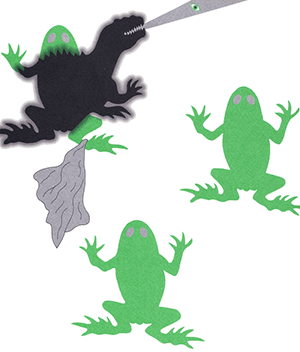
Tim Biskup (b. 1967) is an American artist generally considered to be a part of the group that has been dubbed ‘lowbrow’ or pop surrealism. His free-spirited style recalls 1950s storybook illustration, with bright colors and whimsical shapes unrestricted by the black outlining typically used in character design.
He works with playful and vibrant psychedelic imagery in the pop-design genre that emerged in the late 20th century through such diverse media as silkscreening, textile production, and rotocast vinyl. He is also a significant contributor to the ‘GAMA-GO’ clothing line. However, Tim has stated on his website that he has ceased involvement with the company. Tim works closely with ex wife Seonna Hong, with whom he has a daughter named Tigerlily.
Ester Hernandez
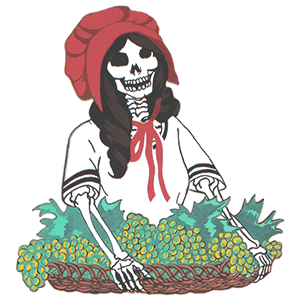
Ester Hernandez (b. 1944) is a Chicana visual artist known for her pastels, paintings and prints primarily depicting Chicanas/Latinas. Her artwork captures time, and makes sense of the complex world we live in. She aspires to create a visual dialogue for women’s role in this new multi-cultural millennium. Her work reflects the political, social, ecological, and spiritual themes born from community pride, a commitment to political action, and an abiding sense of humor.
As a solo artist and member of Las Mujeres Muralistas, an influential San Francisco Mission district Latina women mural group in the early seventies, her career has marked her as a pioneer in the Chicana/Chicano civil rights art movement.
read more »
Gerd Arntz
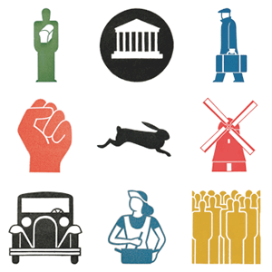
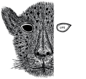
Gerd Arntz (1900 – 1988) was a German Modernist artist – famous for his black and white woodcuts. A core member of the Cologne Progressives he was also a council communist. The Cologne Progressives participated in the revolutionary unions AAUD and its offshoot the AAUE in the 1920s, and in 1928 Arntz was contributing anti-parliamentary prints to its paper ‘Die Proletarische Revolution’ which called for workers to form and participate in worker’s councils. These political prints depicted the life of worker’s and the class struggle in abstracted figures in woodcuts.
In 1926 Otto Neurath sought his collaboration in designing pictograms for the ‘Vienna Method of Pictorial Statistics’ (‘Wiener Methode der Bildstatistik’; later renamed ‘Isotype’). From the beginning of 1929 Arntz worked at the Gesellschafts- und Wirtschaftsmuseum (Social and economic museum) directed by Neurath in Vienna. Eventually, Arntz designed around 4000 pictograms. After the brief civil war in Austria in 1934 he emigrated to the Netherlands, joining Neurath and Reidemeister in The Hague, where they continued their collaboration at the International Foundation for Visual Education.
Neville Brody
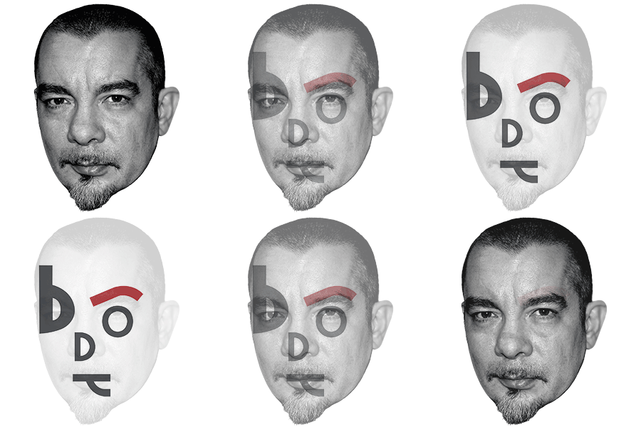
Neville Brody (b. 1957) is an English graphic designer and typographer. He is an alumnus of the London College of Printing and Hornsey College of Art, and is known for his work on ‘The Face’ magazine (1981–1986) and ‘Arena’ magazine (1987–1990), as well as for designing record covers for artists such as Cabaret Voltaire and Depeche Mode. He created the company Research Studios in 1994 and is a founding member of Fontworks. In 2011 he headed the Communication Art & Design department at the Royal College of Art.
As an undergraduate, his tutors often condemned his work as ‘Uncommercial,’ often putting a heavy emphasis on safe and tested economic strategies, as opposed to experimentation. By 1977 punk rock was beginning to have a major effect upon London life and Brody’s work and motivation, which was not well received by his tutors. At one point he was almost thrown out of the college for putting the Queen’s head sideways on a postage stamp design. He did, however, get the chance to design posters for student concerts at the college, most notably for Pere Ubu, supported by The Human League. His first-year thesis had been based around a comparison between Dadaism and pop art.
Emek
Emek (b. 1970) is a popular graphic designer and concert poster designer since the early 1990s. He is widely credited with helping to revive the rock poster scene. He is the brother of artist and author Gan Golan. His style, known for its attention to detail and layers of meaning, infuses socio-political commentary into pop culture imagery.
In the tradition of psychedelic posters from the 1960s, Emek still draws his posters by hand. He was shaped by both rock art posters from the 1960s, and punk flyers from the 1980s. Emek’s poster-making career accelerated in the 1990s with alternative rock acts from Europe and North America, including Pearl Jam, Radiohead, Queens of the Stone Age, Tool, and Marilyn Manson.
read more »
Raymond Loewy
Raymond Loewy [loh-ee] (1893 – 1986) was an industrial designer. Born in France, he spent most of his professional career in the United States. Among his work were the Shell and former BP logos, the Greyhound bus, the Coca-Cola bottle, the Pennsylvania Railroad GG1 and S-1 locomotives, the Lucky Strike package, Coldspot refrigerators, the Studebaker Avanti and Champion, and the Air Force One livery. His career spanned seven decades.
Loewy was born in Paris in 1893, the son of a Jewish Viennese journalist and French woman. He served in the French army during World War I, attaining the rank of captain. He boarded a ship to America in 1919 with only his French officer’s uniform and $50 in his pocket. He lived in New York and found work as a window designer for department stores, including Macy’s, Wanamaker’s and Saks in addition to working as a fashion illustrator for Vogue and Harper’s Bazaar.
read more »
John Pasche
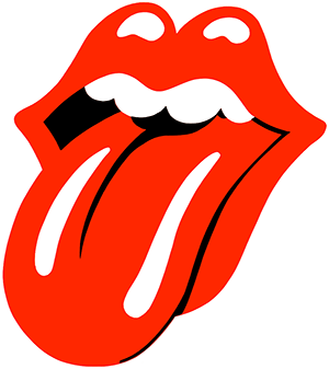
John Pasche is an art designer, most famous for designing the ‘Tongue and Lip Design’ logo for the popular band The Rolling Stones. He designed four tour posters for the Rolling Stones between 1970 and 1974, and also worked for other reputed artists, such as Paul McCartney, The Who, The Stranglers and Dr Feelgood. He works as a freelance designer in Surrey, UK, and he still remains a fan of the band.
Pasche designed the ‘Tongue and Lip Design’ logo in 1971, which was originally reproduced on the ‘Sticky Fingers’ album. In what was perhaps one of the first cases of rock brand marketing, Jagger reportedly approached the Royal College of Art in 1969 looking to commission images for the band. Pasche designed the logo and ended up working for the Stones. ‘Face to face with him, the first thing you were aware of was the size of his lips and his mouth,’ Pasche said.
Anton Stankowski
Anton Stankowski (1906 – 1998) was a German graphic designer, photographer and painter. Typical Stankowski designs attempt to illustrate processes or behaviors rather than objects. Such experiments resulted in the use of fractal-like structures long before their popularization by Benoît Mandelbrot in 1975. Despite producing many unique examples of concrete art and photographics, Stankowski is best known for designing the simple trademark of the Deutsche Bank.
His work is noted for straddling the camps of fine and applied arts by synthesising information and creative impulse. He was inspired by the abstract paintings of Mondrian, van Doesburg, and Kandinsky. Stankowski advocated graphic design as a field of pictorial creation that requires collaboration with free artists and scientists.
Kyle Cooper
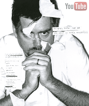
Kyle Cooper is an acclaimed modern designer of motion picture title sequences. He studied graphic design under Paul Rand at Yale University. In 1995 he designed the title sequence for the film Se7en, a seminal work which received critical acclaim and inspired a number of younger designers.
In 1996, he co-founded Imaginary Forces, a design firm, and in 2003 another firm, Prologue, based in Los Angeles. Cooper has also directed a feature film, New Port South (2001), a teen drama produced by John Hughes, based on a script written by Hughes’ son James. The project was filmed in Chicago and scored by Telefon Tel Aviv.
Kazumasa Nagai
Kazumasa Nagai (b. 1929) is a Japanese graphic artist and poster designer. He co-founded the Nippon Design Center in Tokyo in 1960.
Bob Peak
Bob Peak (1927 – 1992) was an American commercial illustrator best known for innovative design in the development of the modern movie poster. United Artists studio hired Peak in 1961 to design the poster images for the film ‘West Side Story.’ The success of Peak’s work on that film led to work on posters for designer Bill Gold.
In the mid-1970’s Peak’s style would become familiar to fans of science fiction films when he created the poster art for the futuristic film ‘Rollerball’ (1975), which was followed by the first six ‘Star Trek’ films, ‘Superman’ (1978), ‘Excalibur’ (1981), ‘In Like Flint,’ and ‘Apocalypse Now’ (1979). By the 1980’s only the movie poster artist Drew Struzan was in as much demand by film directors.
